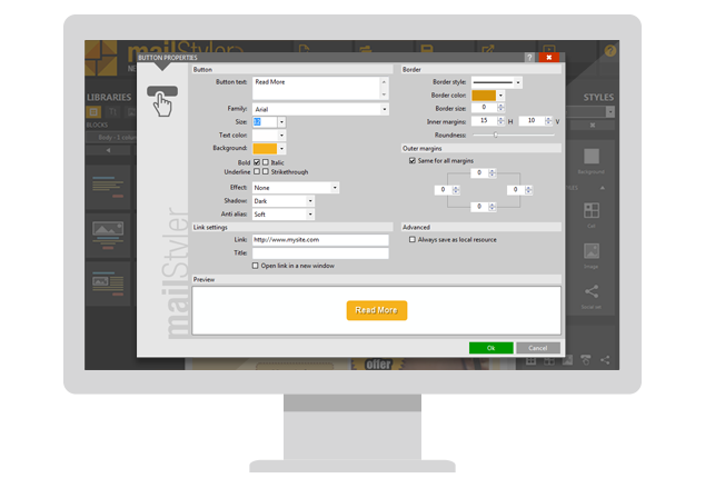
Change the style of the buttons in real time with MailStyler 2
Like all of your template, MailStyler 2 allows you to change the appearance of your newsletter buttons to give you the highest conversion rate for your call to action.
Like all of your template, MailStyler 2 allows you to change the appearance of your newsletter buttons to give you the highest conversion rate for your call to action.
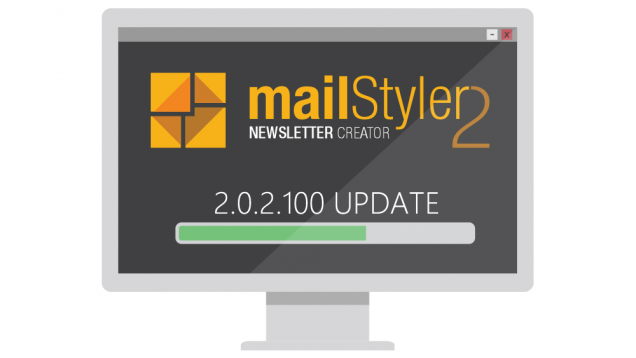
On Thursday, October 19th was released an update to MailStyler 2. Here’s the change log.
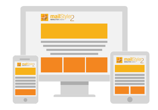
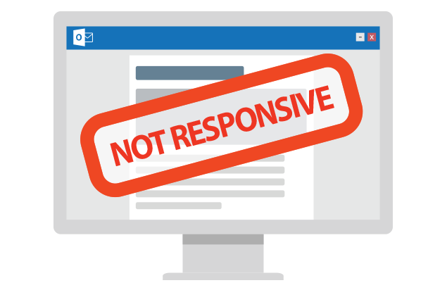
For years now, most emails are mostly read on a mobile device screen (such as mobile phones or tablets) instead of the traditional desktop PC. For this reason, sending newsletters that cannot adapt to the screen on which they are rendered is a severe mistake: not being able to be read by your customers is a big stumbling block. Luckily, responsive design has become a standard rule, allowing you to get fluid layouts that can fit seamlessly on your latest smartphone, 27-inch desktop computer or Galaxy Note.
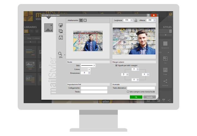
Finding the ideal image for your newsletter, it’s not enough: the image must also merge perfectly with your template and your text. MailStyler 2 allows you to manipulate images to be perfect for your communications.
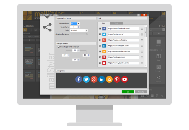
Is it important to be on a social network? For any business, the answer can only be «Yes»: managing a social account can be a source of stress and waste of time, but it is also inevitable if we want to manage personally the image we offer our customers and our public.
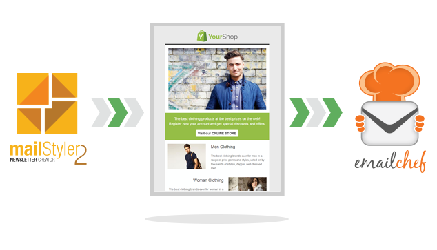
MailStyler allows you to automatically upload your templates to your eMailChef account: eMailChef is the email marketing service that balance professional features with its affordability.
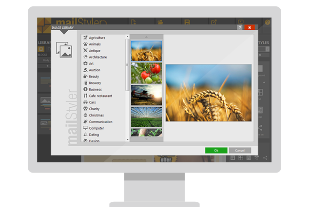
Both the Base and Pro version of MailStyler offer its users a library of high-quality images, to guarantee total freedom when creating a template, and using them is very simple!
One of the reasons why it is always convenient to use a template builder to prepare your newsletter layout is that relying on different tools has a high risk of achieving disastrous results. But it is also necessary to defend from the disasters that await us to use unprofessional solutions for sending our emails.
Litmus and Email on Acid are two services that allow you to check your template by analyzing the code that generated it, finding errors and suggesting alternative solutions to get the job done.
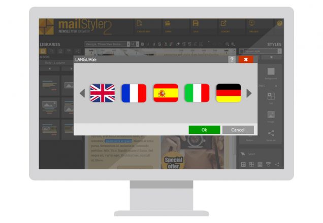
Here at Delivery Tech, we believe that excellent software must be accompanied by excellent support, and that it must meet the primary needs of users: such as being able to use a working tool in their own language.
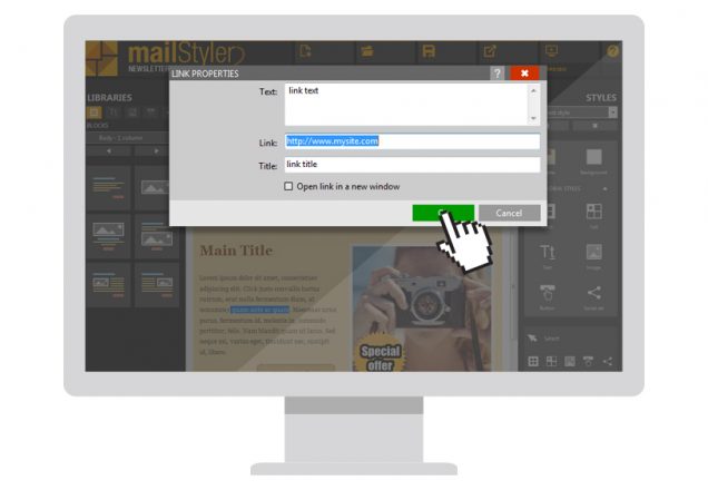
A few links here and there in your newsletter can’t hurt. Think for example about linking the catalog page, for those of us who have an online shop; a landing page where you can buy a product; a simple email address to keep in touch.
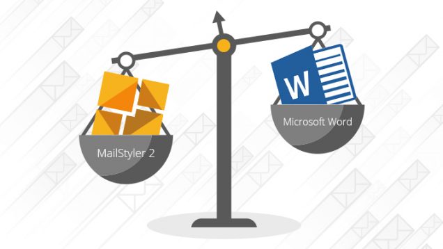
Our grandparents already knew the truth: for every job to do there is the right instrument. Just as Word is great for writing long, structured, formatted documents, so MailStyler has been designed and developed to do one thing for you: templates for newsletters.