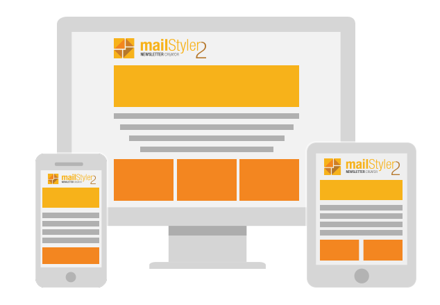
For years now, most emails are mostly read on a mobile device screen (such as mobile phones or tablets) instead of the traditional desktop PC. For this reason, sending newsletters that cannot adapt to the screen on which they are rendered is a severe mistake: not being able to be read by your customers is a big stumbling block. Luckily, responsive design has become a standard rule, allowing you to get fluid layouts that can fit seamlessly on your latest smartphone, 27-inch desktop computer or Galaxy Note.
By default, MailStyler 2 creates responsive templates: to get them you just need to use the drag & drop editor and choose the blocks that best meet the style of your newsletter. The software will take care of everything else, allowing you to focus on the content of your communication.
Create your own layout with (for example) three column text blocks, call to actions, images, and icons of your social accounts: MailStyler will export the template with a correctly and verified HTML code to work on any operating system and email program.
Insert responsive blocks into the template
The responsive templates created with MailStyler 2 will be displayed on any screen, thanks to fluid layouts. Constructing this type of template does not require any additional expertise, as MailStyler 2 creates templates which are responsive by default.
- Move your mouse to the “Library” section, to the block icon.
- Click the drop-down menu and find the different types you can use: header, single text body, two or three columns, call to action and more.
- Choose the type of block you are interested in.
- Drag the block on the template you are working on.
- Repeat this until you have obtained the template you dreamed of.
All the blocks you insert will fit perfectly on the device that your recipients will use to read the newsletter.