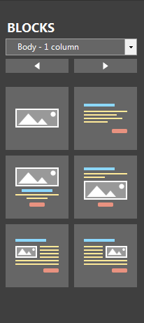
The Block panel is the left element that contains the list of pre-constructed newsletter blocks that you can use to build the layout of your newsletter.
Scroll through the categories by clicking on the top combo box or by clicking the left/right arrows.
The blocks contained in the library are a list of the most common layout block used in today's newsletters.
Each block can be further customized by adding columns and rows, see Block selection & editing from more information.
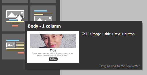
Hover the mouse over each block to see a quick preview of what the block looks like. Keep in mind that the final result will depend on the style currently in use, as whenever a new block is added to the newsletter it inherits the current style.
| The block panel | The block preview |
|
|
| Click to enlarge | |
Once you have identified the block you want to add to your newsletter, simply click it and drag it to the newsletter body. A horizontal indicator will appear showing the insertion point.
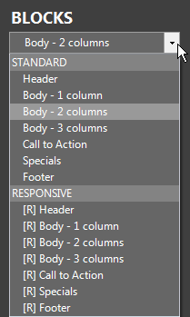
The block library contains 2 categories of blocks:
- Standard blocks.
- Responsive blocks, marked with the [R] logo.
It is advisable to avoid creating newsletter that include both Standard a Responsive blocks.
See Mixing responsive blocks for more information.
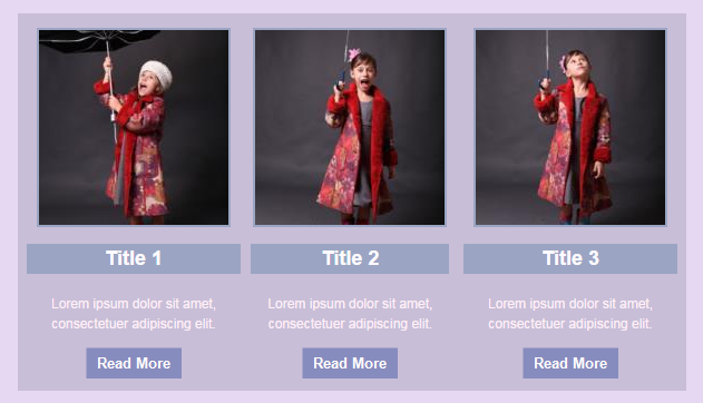
Standard blocks are designed to be used on newsletters that will be generally displayed on PC computer screens, while Responsive blocks are best suited for portable devices, such as tablets and smartphones.
Responsive blocks automatically rearrange their contents vertically when the width of the viewing device is smaller then 600 pixels.
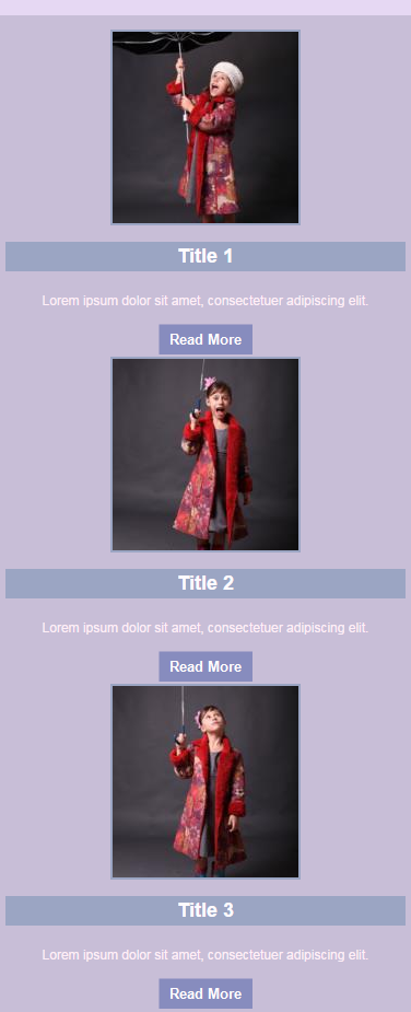
| The block category list | A responsive block when viewed on a display larger than 600 pixels | The same responsive block when viewed on a display smaller than 600 pixels |
|
|
|
| Click to enlarge | ||
See also
Mixing responsive blocks