Each Button in the newsletter can be customized independently form all others and from the Button style.
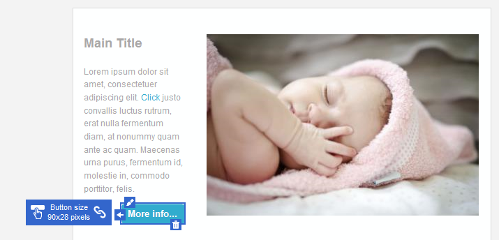
To select a Button, click on it until the Button selection frame is displayed.
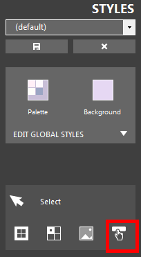
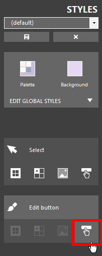
Alternatively, shrink the Style panel and click the Button selection button until the desired button gets selected.
| The Button selection frame | The Button selection button |
|
|
| Click to enlarge | |
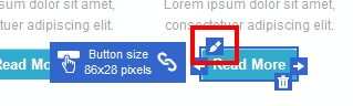
To change the Button appearance, click the edit icon in the upper-left side of the selection frame, or click the Button edit button in the Style panel, once the Button has been selected.
| The Button edit icon | The Button edit button |
|
|
| Click to enlarge | |
Depending on the selection status, you can enter Button editing mode also by double-clicking a Button.
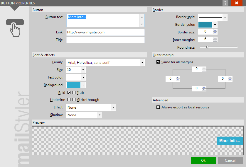
The Button editing form is displayed, where you can change the appearance of the selected button.
See Editing buttons for details on button editing.
| The Button editing form |
|
| Click to enlarge |
ADDITIONAL BUTTON FEATURES
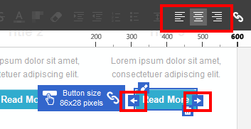
Buttons can be horizontally aligned by clicking the alignment icons visible on the left and right edges (depending on the current alignment), or the alignment icons on the Toolbox.
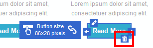
Buttons can be deleted by clicking the Delete icon placed in the lower-right side of the selection frame.
| The alignment icons | The Button delete button |
|
|
| Click to enlarge | |
See also
Top menus
The toolbox
The block panel
The style panel
Block selection & editing
Cell selection & editing
Image selection