Today more than half of your readers will likely open your newsletter on a mobile phone or a tablet, and then maybe check it again on a computer. That’s why when it comes to build your email template it’s extremely important to ensure its readability on multiple devices, which is exactly what MailStyler provides.
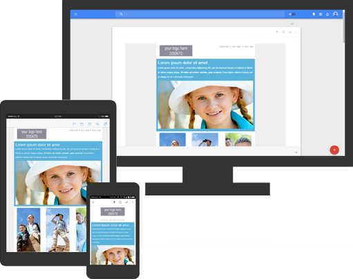
A responsive HTML email template made with MailStyler guarantees the optimal reading experience without resizing and scrolling, since the newsletter automatically adjusts to any screens. Thus looking perfect no matter where it’s opened: check yourself.
Thanks to its easy drag&drop blocks system, MailStyler allows you to create a total responsive email template without any html and css coding knowledge. You can design your own brand-focused template in few minutes; you will not be be forced to choose some ready-made one anymore.
This is very important in a successful marketing campaign. In fact, no matter how good the ready-made templates are, they will be never unique and completely tailor-made for your brand. They will surely fit the general category of your business or activity, but the truth is that a fully personalized layout is completely different kind of story — and a huge hit in terms of brand awareness.
So don’t waste your time looking for responsive layouts here and there on the web. Start building your own brand-oriented responsive email template with MailStyler now.